to me, web 2.0 is blogs, wikis, youtube etc where I can interact with the site and add information or upload comments or videos rather than just viewing someone else's information. and to some extent the technologies like Ajax so the screen doesn't completely refresh (and flash) every time I click a button.
so what makes a web site a web 2.0 site ? if it isn't one that I can interact with ? is it just big buttons and big icons ?
can anyone give examples of a site that is web 2.0 and one that isn't and say exactly what would make the non-web 2.0 site into a web 2.0 site ?
and if you are thinking of buying something online and you click a link and get to a web site that doesn't look like a 2.0 web site, do you think "Oh no, it doesn't look like a web 2.0 site so I'm not buying anything from them ?"
would be great to hear people's views.
regards
Tom
Web 2.0 is really just a buzz phrase. It's hype hit the streets in 2004 and it was 2005 when I remember every web dev saying its got to be web 2.0. My Local Services last major facelift was in 2005, and the idea was to make this a web 2.0 site. Whether it is or not is upto indvidual interpretation. The thinking at the time, (at least on the directory front) was to move away from the 1990 era websites, with scrolling text, clip art, noisy homepages and lots of clutter, and move to cleaner lines, with big bold call to actions. So big buttons and curves were in, noisy square cluttered portal information overload style sites were out. At the time, Yell was still a square unispiring site, and applegate.co.uk was the benchmark of 1990's design (and hasn't actually changed that much, but is still very popular). Now, a few years on, and social media taking over the world, web 2.0 has seemed to changed direction again, and it must include twitter feeds, facebook, live feed from your grandma... Sites now seemed to be evolving again, the first wave of so called web 2.0 style sites have either rebranded or refreshed their design again, or in the process of it (us included). A particular favourite of mine (design not company  ) is Yells latest site. It very clean fresh, very obvious what it is, how it works and what you need to do. When you only have a split second to explain yourself, you can't ask for any more than that. ) is Yells latest site. It very clean fresh, very obvious what it is, how it works and what you need to do. When you only have a split second to explain yourself, you can't ask for any more than that.So maybe we are we now in web 2.5? I think it's become a bit of a religion, and you can pretty much interpret web 2.0 however you want. But as a sales vehicle, which most of us who run eccomerce sites want, then look to your biggest comptetitors, who have the most to spend on research and development, and copy the best bits, trial it and let your conversion rate be the judge.
Thats just a buzz phase or even a hype that gets thrown around on the internet
“Web 2.0 is really just a buzz phrase. It's hype hit the streets in 2004 and it was 2005 when I remember every web dev saying its got to be web 2.0. My Local Services last major facelift was in 2005, and the idea was to make this a web 2.0 site. Whether it is or not is upto indvidual interpretation. The thinking at the time, (at least on the directory front) was to move away from the 1990 era websites, with scrolling text, clip art, noisy homepages and lots of clutter, and move to cleaner lines, with big bold call to actions. So big buttons and curves were in, noisy square cluttered portal information overload style sites were out. At the time, Yell was still a square unispiring site, and applegate.co.uk was the benchmark of 1990's design (and hasn't actually changed that much, but is still very popular). Now, a few years on, and social media taking over the world, web 2.0 has seemed to changed direction again, and it must include twitter feeds, facebook, live feed from your grandma... Sites now seemed to be evolving again, the first wave of so called web 2.0 style sites have either rebranded or refreshed their design again, or in the process of it (us included). A particular favourite of mine (design not company ) is Yells latest site. It very clean fresh, very obvious what it is, how it works and what you need to do. When you only have a split second to explain yourself, you can't ask for any more than that.So maybe we are we now in web 2.5? I think it's become a bit of a religion, and you can pretty much interpret web 2.0 however you want. But as a sales vehicle, which most of us who run eccomerce sites want, then look to your biggest comptetitors, who have the most to spend on research and development, and copy the best bits, trial it and let your conversion rate be the judge.” Yep remember those big glossy buttons. Ah memory lane. Accounting Help
“Web 2.0 websites generally will have a shiny logo that has a gloss effect and most likey a reflection. Also, the site will most likely have rounded corners. There will probably will be gradients used in the design of the layout. These kinds of websites will have lots of script.aculo.us affects added. These include fades and motions. If you see a moving object and wonder why it isn't Flash, then this is your answer. You will notice that there are lots of smooth moving objects and that there are absolutely no tables or iframes. NONE. Everything will be done with CSS.” Big glossy buttons. Some so glossy that you had to wear your shades Does anyone remember the trend of the one page portfolio website?Accounting Help
Thanks for the steer! Only just realised a little Yoda had infiltrated us! Terminated...
“Thanks for the steer! Only just realised a little Yoda had infiltrated us! Terminated... ”Steve it was the closes emoticion to Gollum. Sorry. Accounting Help |
Recent Posts Is email marketing still worth it in 2024? 1 comments What strategies have you found most effective in reaching and engaging a local audience through email? 2 comments  JSP 101 Defence writing guide and why you should use it  The BBC rebrands - or does it? 1 comments Which Category of Business Top in the World? 4 comments  5 Interesting Marketing Trends from 2020 4 comments Property Inventory Services 5 comments  Need Help with GTIN number (which is associated with bar codes) 1 comments 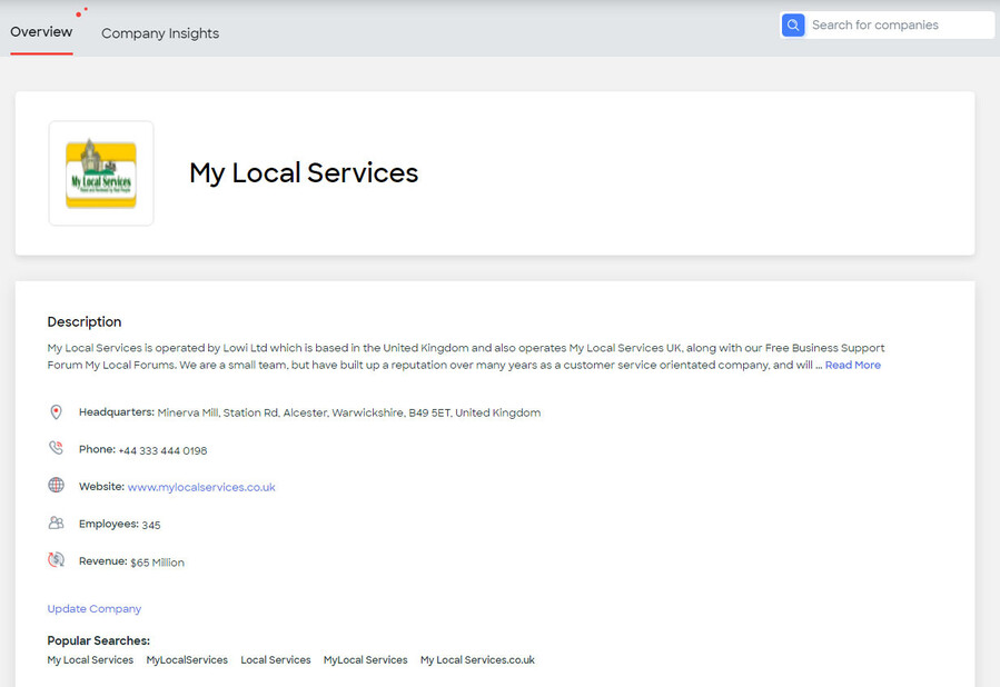 Competitor Info - ignore the automated apps 1 comments Know About Google Display & Video 360 Advertising? 1 comments Anyone GDN for your Business Promotion?  Six Ways to Use a Blog in Marketing, It’s as Easy as ABC…. 7 comments How Can Double the Website Traffic? 16 comments Small business are shut of on COVID 19? 17 comments YouTube Advertising is Cost Effective? 2 comments |

