Do pretty websites convert sales?

By : Administrator
Published 8th May 2015 |
Read latest comment - 28th January 2016

Great post from Seth Godwin:

"Pretty websites

...are rarely websites that convert as well as unpretty ones.

If the goal of your site is to position you, tell a story, establish your good taste and make it clear what sort of organization you are, then pretty might be the way to go. And you can measure the effectiveness of the site by how it impresses those you seek to impress, by its long-term impact.

But it's a mistake to also expect your pretty website to generate cash, to have the maximum percentage of clicks, to have the most efficient possible funnel of attention to action.

There's always been a conflict between the long-term benefits of beauty in commerce (in architecture, in advertising, in transactions) and the short-term brutality of measurement and direct response."

Full article: Pretty Websites

He does speak a lot of sense and it's an area I've always struggled on. Balancing cosmetics, functionality, calls to action and generating hard cash and conversions.

It took me a long time to realise (and I still don't understand) that sometimes a web page or a sales mail just works and doesn't need any tinkering or bells and whistles, regardless of how you think it looks. They distract, add noise and take attention from the primary objective, conversation/sale/lead.

I should probably add more adverts across the forum, but I genuinely dislike adsense, regardless how much revenue it brings in. A compromise is more adverts show for non members or if you aren't logged in, but they are still not too imposing (I think). So vanity over rules commercial sense.

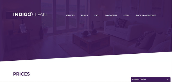
But the hardest pages to optimise from a sales point of view has to be the home page. So little time to catch someones attention, make it blatantly obvious what you do, and have an obvious call to action to hook their attention and turn them into a lead/conversion/customer. We've experimented heavily over the years with things like split testing and have got to a formula that works for us. Personally I'd love to start afresh with a different design, but it's a huge risk when you have a working model, and I then fall into the playing trap.

How do you get on with your website? Are you prettier than your competition but your competition is more successful? Have you lost leads and sales after moving to a pretty website and regretting leaving your old unfashionable one?

Maybe you're a tinkerer and can't leave your site alone?


Steve Richardson
Gaffer of My Local Services
My Local Services | Me on LinkedIn
Comments

Good article.  I agree it can be a challenge and a balance needs to be made.

The importance of a landing page can't be overstated.  Many times people will get to a website via Google which will not necessarily take them to the home page and therefore the page can be tailored to meet needs e.g. call to action / conversion.

If a site is not "pretty" it still needs to perform functionally and look professional.


Not to sure about pretty ,but it needs to function well and not look basic if you see where I am going. To many bells and whistles can be detriment to your site ..Although I think there is a similar thread about this


Thanks,
Andy-C | Pewter World

Beauty is in the eye of the beholder. .. You definitely need other people to give you feedback on your site as you may be too close to it.  

To me there is beauty in precision and as soon as I spot a grammar or spelling error I question the credibility of the site.  But then that is my job and you can't turn it off! 

I'm using a friend to set up my website which is a dangerous game I think!  We've both procrastinated about it far too much. I've managed to get work without a website at all so far.... But I really do need to get it sorted!  


 I'm using a friend to set up my website which is a dangerous game I think!  We've both procrastinated about it far too much. I've managed to get work without a website at all so far.... But I really do need to get it sorted!  ”
 

I think it's a dangerous game, unless they are a web designer. A home made effort sometimes can be worst than having no site


Steve Richardson
Gaffer of My Local Services
My Local Services | Me on LinkedIn

I think it's a dangerous game, unless they are a web designer. A home made effort sometimes can be worst than having no site
 

Oh sorry,  I didn't say,  he is a web designer! But he's doing it as a favour so it's taking forever.  


How do you get on with your website? Are you prettier than your competition but your competition is more successful? Have you lost leads and sales after moving to a pretty website and regretting leaving your old unfashionable one?


Maybe you're a tinkerer and can't leave your site alone?”


I think a pretty website is only half the battle, you need to actually get people to your website and then ultimately it has to be optimised to convert once they are there.

A simple and functional website will always out convert a beautifully designed but difficult to use website.

I would say our website is "prettier" than any of our local competitors websites but we have also focused heavily on user experience and customer flow with prominent calls to action and a simple interface.

It's important to consider that a "pretty" website can also inspire trust in your customers especially if you are taking payment online, I'd definitely feel more comfortable putting my card details into a well designed website then I would a DIY freesite.


Thanks,
Indigo Clean - Luke

I think it's not all about having a pretty site - users will value responsiveness and speedy access to information more than a perfect animation. 


Fixed Fee Legal Services | Bespoke Document Drafting | Document Templates

"pretty" website can also inspire trust in your customers especially if you are taking payment online, I'd definitely feel more comfortable putting my card details into a well designed website then I would a DIY freesite.
 

Agree completely, but I think the point our man Seth was getting at, was not so much DIY versus professional site, I think few people would argue against that. It was more simple rough and ready in your face conversion/money making machine, versus aesthetically pleasing. Or pretty pictures painting a story, versus text saying we do this, buy it here.

I really like your site, visually it looks the business. But you consciously sacrifice 50% of your visual above the fold real estate with a purple image, when viewed on a desk top, forcing a user to scroll. 

The curse of responsive design or deliberate from user testing.

Applying the Seth approach, and stripping out the pretty bit, you would be left with this above the fold:

Question is, does one way work better than the other? I guess that's the crux of the argument. But that's one for analytics, conversion data and split testing. 

In the old days we used to be paranoid about making the visitor making more than 2 clicks to get to a call to action. With mobile now ruling(ish) the roost, maybe scrolling has taken over from clicks?

I'm sat at a responsive cross roads as we toy with possible new designs for MLS. I want sleek sexy and pretty, where as the current separate mobile site and old school fixed template desktop works well and is commercially safe. Get it wrong and it gets expensive  


Steve Richardson
Gaffer of My Local Services
My Local Services | Me on LinkedIn

Just about to post this on Facebook and looking for a suitable image, when accidentally came across these two blasts from the past.

The original pages for both Facebook and Google. Albeit rough and ready when they were at the start up stage, the home pages have pretty much stayed to the non pretty formula, even though they have the budget to be stunning.

Versus Bing and it's current background imagery and distraction. 

Food for thought?


Steve Richardson
Gaffer of My Local Services
My Local Services | Me on LinkedIn

This Thread is now closed for comments