 https://www.facebook.com/indigohomeclean
 @indigohomeclean
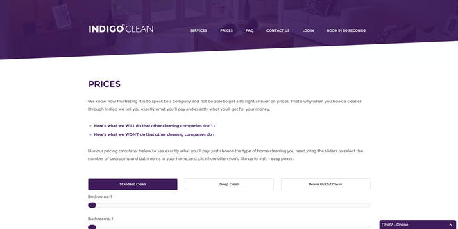
I really like your site, visually it looks the business. But you consciously sacrifice 50% of your visual above the fold real estate with a purple image, when viewed on a desk top, forcing a user to scroll.
(IMG REMOVED FOR SIMPLICITY)
The curse of responsive design or deliberate from user testing.
Applying the Seth approach, and stripping out the pretty bit, you would be left with this above the fold:
(IMG REMOVED FOR SIMPLICITY)
Question is, does one way work better than the other? I guess that's the crux of the argument. But that's one for analytics, conversion data and split testing.
In the old days we used to be paranoid about making the visitor making more than 2 clicks to get to a call to action. With mobile now ruling(ish) the roost, maybe scrolling has taken over from clicks?
I'm sat at a responsive cross roads as we toy with possible new designs for MLS. I want sleek sexy and pretty, where as the current separate mobile site and old school fixed template desktop works well and is commercially safe. Get it wrong and it gets expensive  ”
”
