We have been working on our long awaited site rebuild behind the scenes for some time now, which has really been centred around the database, searching, speed and functionality.
Now it's time to start looking at the visual and presentation of the new site.
Our first aim is to get away from the dated fixed width template which we currently have, and replace our separate mobile and desktop sites with a single responsive site. Visually, everything will be larger and clearer.
Our second aim is move away from the current cluttered look and feel of the directory, while allowing more functionality, a much better URL structure for Google, whilst implementing our new database search.
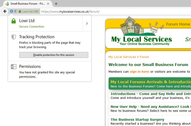
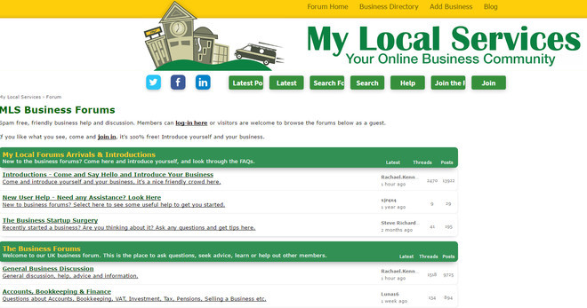
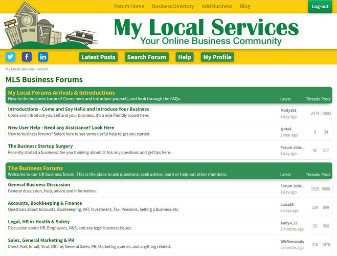
I've got a couple of screen shots, the first is a directory search results page, and the second is the forum home page. I don't really want to tinker with the forum, so it will just be larger font, but will scale to your browser or phone. But we are going with a big and bold logo and name versus the current look. You can select each image to see a bigger version:

Bottom half of the search results page - big header disappears but search bar remains.

Footer is just a test at the moment.
Then below is forum home page with new header.

Obviously these are just images, so the page will be centred and fill your screen.
But honest thoughts? Does it make your eyes bleed, does it look ok, or do you prefer the current site?
 All I know is, is that out of lets say one billion websites out in cyberspace yours is the only one where I have to open firefox to read anything otherwise it just comes up as the mobile website..... ever since the last revamp, not even sure I find it annoying anymore, obviously other sites have mobile sites and i don't have a problem with anything else...
 Well that should be consigned to history as their will only be 1 site. But if I can get the Barney seal of approval then that's good enough for me