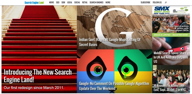
New website design - what were they thinking?

By : Administrator
Published 12th August 2014 |
Read latest comment - 9th September 2014

A favourite haunt of mine is Search Engine Land and is a good place to get a catchup on all things Google or find any news of interest.

But this morning I was slapped in the face with a new look website.

Maybe I'm not with the in crowd, but I'm not a fan of these hug in your face images and long scrolling pages. I know why they do it, to make it responsive for mobile and tablet devices. Just doesn't work in my humble opinion 

Maybe it's just me, and I'm not up with the times. What does anyone else think?


Steve Richardson
Gaffer of My Local Services
My Local Services | Me on LinkedIn
Comments

Maybe it's aimed at youngsters who seem to like this kind of thing!


Thanks,
Pubby

I don't know I am young, in my mid-late twenties, and I find it quite aggressive. It will appeal to some people it almost has the style of the tabloids where they have BIG LETTERS ABOUT SOMETHING EITHER DANGEROUS OR LIFE CHANGING. However saying that it wouldnt put me off the website if i know the content is good. 


Louise
CEO Resonate Media

I think you are right in the sense that these websites are basically constructing themselves to be more compliant with tablets and phones, much like the Windows 8 OS constructed to favour the new touch screen notebooks. Personally, I don't like these designs. I think they are bulky and have no substance.  


Sam Allen - avecSys
Technical advisor and Sales associate

This Thread is now closed for comments